Friday, April 30, 2010
Monday, April 26, 2010
Reflection

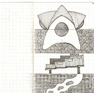
This drawing is cool, it gives a great contrary which is black and white. According to Russel, the artist did watercolor drawing in different way, instead of using light color first, he uses black color first which give you layers of color and composition. On my desigh, i might try to use more contrary, such as straight line and curve, circle and retangle, which makes the design more interesting. Futhermore, i might use shadows, which can give the design looks more stereovision, or i might combine each single elements in different ways.
Sunday, April 25, 2010
Electroliquid Aggregation
3 combine parallel projections
Monday, April 19, 2010
Quotes from three clients
-Nicole Kuepper
(Kuepper, Nicole, 2008.Nicole Kuepper's Inkjet-Printed Solar Cells: The World's Cheaptest. Vedio: http://www.greenoptimistic.com/2008/10/10/cheapest-inkjet-solar-cells (accessed 19/04/10).
"Most sets of values would give rise to universes that, although they might be very beautiful, would contain no one able to wonder at their beauty."
-Stephen Hawking
(Hawking, Stephen. 1992. A brief history of time : a reader's companion. New York London : Bantam Books)
“I have called this principle, by which each slight variation, if useful, is preserved, by the term Natural Selection.”
-Charles Darwin
(Lucidcafe. Charles Darwin-Naturalist, 1809 -1882. http://www.lucidcafe.com/library/96feb/darwin.html (accessed 19/04/10))
Thursday, April 8, 2010
Animation 2
Im sorry it still get cut at the beginning which hapens to animation 3 as well, i have asked lots people, and tried different angles, resolution, textures, and it just cant help to stuck, what i can do is to delete the texture of the bottom studio which makes it slightly better.


